

Are Stock Investors Doomed?
Why bearish analysis from JPMorgan is less convincing than it might seem.

One way to measure the value of a stock is to look at how much it costs an investor to buy a dollar of earnings. Suppose that a company generates $10 in income per share each year and has a stock price of $100. In this case, it costs an investor $10 to buy a single dollar of annual earnings, resulting in a price-to-earnings ratio of 10x.
This ‘PE ratio’ offers a simple and useful way to assess stock valuations. And right now, PE-based measures are all telling a similar story about US equities: stocks are expensive. As of January, a popular PE-variant that smooths out earnings over the business cycle was 37x, higher than 96% of previous monthly readings.
For some investors, these valuation levels are a warning sign. Stocks typically become more expensive during periods of bullish optimism and high expectations. This can lead to significant downside risks if growth disappoints and valuation levels shrink to their long-term averages.
Playing to this fear, a new chart from JPMorgan has been making the rounds, appearing to confirm that today’s valuation levels spell doom for US equity investors. The analysis shows long-term returns for stocks being tightly linked with initial valuation levels. According to the chart, high PE ratios at initial investment result in lower equity returns over the following 10 years (and vice versa).
Most relevant for today’s investors, the chart shows the S&P 500’s current PE ratio translating into expected returns of -2% to +2% per year over the next decade. If that occurs, it could result in a lost decade of equity growth. This analysis is certainly foreboding - but does it hold up to closer scrutiny?

Thankfully, no. Equity investors are right to be wary of today’s valuation levels, and the idea that purchase price matters for investment performance is undoubtedly correct. This JPMorgan chart, however, is misleading to the point of irresponsibility. In reality, the relationship between valuations and returns is not as tight as the analysis purports to show, and there is no reason to conclude that today’s equity investors will necessarily experience such dismal returns.
A Brief Discourse on Statistics
Before scrutinizing the chart, a brief statistics refresher will be helpful. Basic statistics teaches us that our confidence in the relationship between two variables (like valuation levels and subsequent returns) increases as we get more data. An important caveat, however, is that this data needs to be independent.1
To understand the pitfalls of relying on non-independent data, imagine that you’re the principal at a high school trying to determine if a new teaching method will result in better classroom test scores. You run an experiment asking the teachers of three separate classes (math, science, and history) to use the new method. After a year, you check back in with the three classes - and voilà. Average test scores have improved markedly.
Looking at the class rosters, however, you notice a problem. Although the three classes may have been distinct subjects, the actual students attending each class were nearly identical. The separate experiments you thought you were running turned out to be massively dependent on each other, to the point where a single observation was masquerading as three separate data points.
This doesn’t necessarily mean that the observed relationship is bunk - after all, scores did climb noticeably. It’s possible, however, that this group of students happened to be particularly receptive to the teaching method, or that using the method on the same group in three different classes increased its effectiveness. Either way, more independent observations are necessary to truly understand how the teaching method impacts classroom test scores.
The bottom line is that more data is only useful if it actually provides us with new information. Otherwise, it just leads us to draw unjustified and overconfident conclusions that overestimate the strength of statistical relationships.
Breaking Down the JPMorgan Chart
The JPMorgan chart gets its authority from the sheer number of data points it shows, appearing to demonstrate a tight historical link between valuations and returns. As our preceding discussion demonstrated, however, more data is only more convincing if each observation is independent. And therein lies the core problem with the JPMorgan analysis: it rests on highly overlapping time period data to make the valuation-return relationship seem far stronger than is truly justified.
As the footnotes indicate, the chart uses data stretching back to 1988, just 37 years ago. Since then, there have been fewer than four separate windows in which to evaluate 10-year returns. The chart has far more than four data points, however, because it plots the PE ratio and subsequent 10-year annualized return on a monthly basis (resulting in ~324 observations since we don’t have 10-year return data yet for years beyond 2014).
The problem with this approach is that each additional monthly observation offers extraordinarily little new information. Consider that the observation for the 10-year returns following January 2000 reflects the index’s performance from 1/2000 to 1/2010. The observation for February 2000, however, shows the index’s performance from 2/2000 to 2/2010. This means that out of the 120 months in the January 2000 observation, 119 of them are repeated in the February 2000 observation - the content of new information in this separately plotted data point is less than 1%.
To make this concern a bit more concrete, consider that long-term returns between 1988 and 2014 were overwhelmingly dominated by just a few key events (namely, the dot-com bubble and the global financial crisis). To be clear, these events can surely teach us something about the relationship between stock valuations and investment performance. But by having these two events drive hundreds of different data points, we risk confusing a few important lessons for the entire class, syllabus, and textbook.
Non-Overlapping Return Data is Less Convincing
To explore these concerns more deeply, we can attempt to reconstruct the JPMorgan chart and see how the conclusions hold up to non-overlapping investment periods. Data limitations mean that we are restricted to an alternative form of the PE ratio which captures the preceding year’s worth of earnings rather than the next year’s forecast (‘trailing PE’ vs. forward PE). Moreover, we need to rely on quarterly data points, not monthly. However, after removing some significant outliers relating to the 2008 financial crisis, our scatter plot shows a similar trend to JPMorgan’s (albeit with a slightly more rosy long-term return estimate).2

Now, what would this chart look like if we used distinct 10-year return windows? To see, we can use the three periods 1994-04, 2004-14, and 2014-24. Plotting these observations reflects almost all of the true information content in the preceding chart. The reader can judge for themselves how convincing the resulting chart is in terms of the relationship between valuations and returns.

While we don’t have enough data to inform meaningful insights across a 10-year return horizon, we might be able to learn something about short-term returns. The below chart summarizes the relationship between PE ratios and subsequent one-year returns using non-overlapping windows.3 While there’s possibly some evidence of an inverse relationship here, it’s very weak and incredibly noisy.
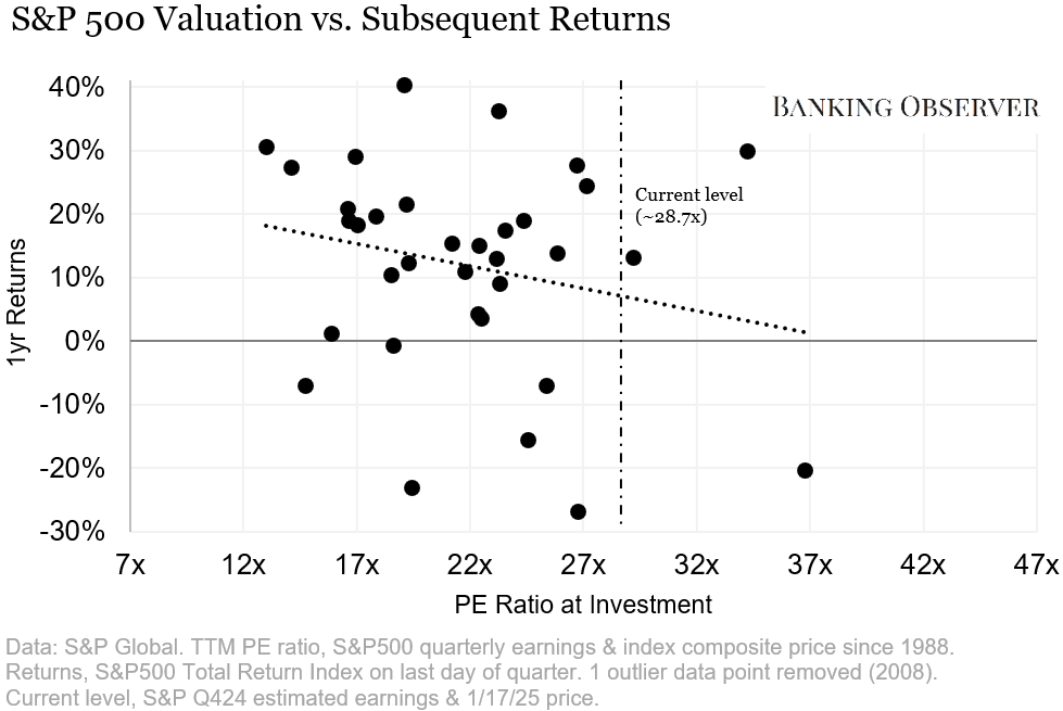
One potential argument is that the absence of a meaningful relationship over one year means we should also expect the absence of a meaningful relationship over 10 years. After all, a 10-year return is nothing more than a sequence of reinvested one-year returns. While this logic needs to address a host of statistical and financial qualifiers to be convincing, it provides one more reason to be dubious about the strength of the relationship shown on the original chart.
Conclusion: Confidence Game
Beyond these statistical arguments, there are also financially grounded reasons to be skeptical of the JPMorgan analysis. Implicitly, the chart assumes that investors should consider PE ratios from decades ago as directly comparable to PE ratios today. But there are valid reasons to think that changes in certain variables should result in PE ratios that differ structurally over time, such as risk-free rates, the amount of cash generated per dollar of earnings, and the proportion of the index comprised of high-growth capital-light business models.
To reiterate, this article is not meant to argue that there is no relationship between initial valuations and subsequent returns. It seems both logical and plausible that buying expensive stocks increases the risk of disappointing long-term returns. And by most metrics, US equity markets do seem historically expensive today.
Gauging the strength of this relationship, however, is a far more complicated endeavor than asserting its existence. In making investment decisions, overconfidence in a weak trend can be just as damaging as ignorance of the trend itself. We can’t say for sure that equity investors have a bright future ahead, but we also can’t say for sure that they have a gloomy one.
Technically speaking, the classical assumption is that the error terms are independent, not necessarily the data itself. Moreover, advanced statistical models can handle non-independent data.
In terms of outliers, we had to remove four quarters of TTM PE ratios from quarter-end 12/31/2008 to 9/30/2009. A massive -$23.25 earnings loss in Q4 2008 resulted in TTM PE ratios of 60.7, 116.3, 122.4, and 84.3 respectively for those quarters. While JPMorgan does not mention the removal of outliers in their footnotes, we assume that this was not necessary for a chart based on forward PE ratios. In any case, including these outliers would actually have decreased the strength of the inverse valuation-return relationship, as investors realized healthy profits in the decade after investing at these levels.
We’ve been careful to use the term non-overlapping to describe this data, rather than independent. In reality, there are valid reasons to think that market returns are autocorrelated year to year. Deeper investigations of the statistical relationship between valuations and subsequent returns would need to address this.